
How Color Influences Mood and Behavior in Home Spaces
Color is a powerful tool in interior design, often acting as an unspoken language that shapes our experiences within a space. The shades that surround us at home influence not only the visual appeal of our environment but also impact our emotions, thought patterns, and daily behavior. Understanding how color psychology works allows homeowners and designers to craft spaces that nurture desired moods, productivity, and even relaxation. By carefully choosing the colors for walls, furnishings, and décor, you can elevate both the ambiance and functionality of every room in your home.
The Science Behind Color and Mood
Psychological Response to Warm Colors
Warm colors such as reds, oranges, and yellows naturally elicit feelings of warmth, energy, and excitement. This is largely due to their association with sunlight, fire, and heat, all elements tied to survival and sociability throughout human history. When incorporated into home spaces, these colors can boost energy levels and encourage activity, making them suitable for social areas like living rooms and kitchens. However, overuse can sometimes lead to feelings of agitation or restlessness, so it’s important to balance them thoughtfully for a harmonious environment.
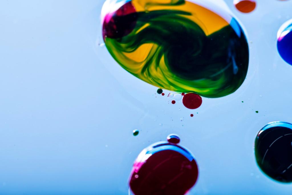
Calming Effects of Cool Colors
Cool colors like blues, greens, and purples are renowned for their calming and soothing qualities. These hues echo the peace of nature—think open skies, lush forests, or tranquil lakes—and they help slow down the heart rate, reduce stress, and foster relaxation. Bedrooms, bathrooms, and reading nooks often benefit the most from cool colors, creating sanctuaries where the mind can unwind. However, if overdone, cool tones may sometimes introduce a sense of coldness or detachment, so layering with warm accessories can counterbalance their effect.
Neutral Tones and Emotional Balance
Neutrals such as whites, grays, and beiges often serve as the backbone of an interior palette. They offer a versatile backdrop that supports a sense of stability, openness, and order. Neutrals don’t typically evoke strong emotional responses, but their understated nature allows other colors to shine and provides a sense of calm continuity throughout a home. Thoughtful use of neutral shades can also enhance natural light, expand the sense of space, and offer a blank canvas for expressing changing moods through accent colors.
Previous
Next
Soft and Muted Palettes
Soft or muted versions of any color can make an environment feel tranquil and approachable. These hues, often achieved by adding gray or white to a pure color, create understated elegance and are less likely to create visual fatigue. Muted palettes work especially well in spaces dedicated to reflection, relaxation, or intimate gatherings, such as bedrooms or meditation rooms. Their subtlety allows for easy integration with varied textures and decor while maintaining a soothing backdrop that welcomes all occupants.
Vibrant and Bold Statements
High-intensity colors offer a dynamic and confident ambiance that immediately captures attention. Saturated reds, blues, and greens stimulate the senses, heightening alertness and injecting a burst of energy into any space. When used effectively—perhaps as a feature wall, bold piece of furniture, or artistic accent—they can define a room’s purpose and elicit enthusiasm. However, because intense shades can sometimes feel overwhelming, it’s wise to incorporate them mindfully, ensuring the result remains engaging rather than exhausting.
The Role of Light in Color Perception
Natural and artificial lighting profoundly impact how saturated or intense a color appears within a home. A north-facing room may cool down warm hues, while southern light can make cool tones feel softer and brighter. The interplay between light and color can shift the atmosphere of a space throughout the day, redefining the mood and behavior it encourages. Thoughtful consideration of lighting sources alongside color choices delivers consistent, desirable effects, regardless of the time or setting.