
Understanding Color Psychology in Interior Design
Color psychology plays a pivotal role in interior design, guiding the artful selection of hues to evoke desired emotions, influence behavior, and create harmonious living environments. By exploring the relationship between color and mood, designers can craft interiors that not only please the eye but also enhance well-being and functionality. This comprehensive guide delves into how different colors impact spaces and people, equipping you with the knowledge to make intentional choices that transform any interior.
The Basics of Color Psychology
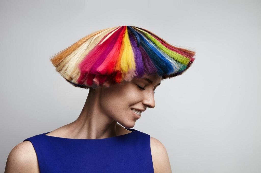
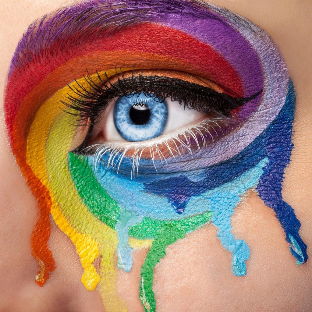
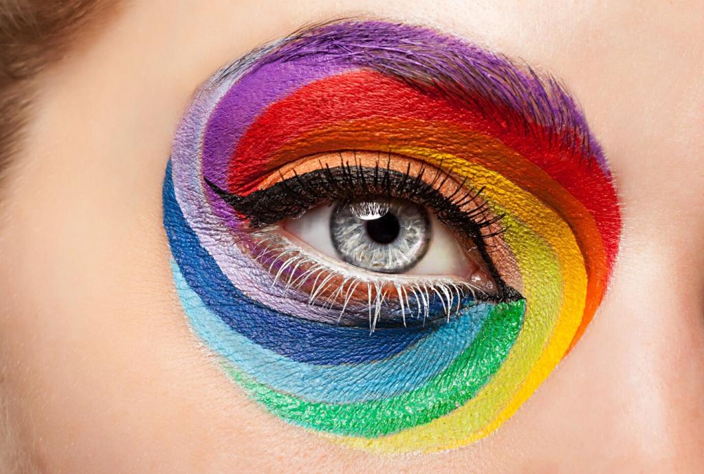
Color perception is deeply rooted in both biology and culture. When light hits our eyes, it triggers a series of reactions in the brain that result in emotional responses. Scientists have discovered that certain colors consistently evoke particular feelings—red can stimulate, blue can soothe—though individual experiences and cultural conditioning also play important roles. By understanding the science, designers bridge the gap between physical reality and emotional experience.
Warm Colors and Their Role
Stimulating Social Interaction
Warm colors tend to foster sociability and open communication, making them perfect choices for dining rooms, kitchens, and living areas. Their energetic appeal encourages people to engage with one another, break the ice, and participate in shared activities. Designers often employ these hues to create a backdrop where friends and family feel comfortable lingering and interacting.
Enhancing Visual Warmth
Rooms that face north or receive little natural sunlight can often feel cold or uninviting. Introducing warm colors in the form of paint, furniture, or accessories can visually warm these spaces, creating comfort even in the absence of real heat. Designers strategically use warm hues to counterbalance architectural drawbacks and infuse spaces with a sense of coziness.
Creating a Focal Point
Red, orange, and yellow hues are naturally attention-grabbing. When used thoughtfully—for example, as an accent wall or in statement pieces—these colors can help define a room’s focal point and add drama. This technique directs the viewer’s gaze while also creating a sense of energy and excitement within the interior.
Cool Colors for Calm and Focus
01
Shades of blue and green are often associated with nature—think sky and foliage—which can have a deeply calming effect on the mind and body. Incorporating these colors into bedrooms or recreational spaces helps reduce anxiety and stress, making it easier to unwind after a long day. Designers use cool tones to cultivate serenity and enhance well-being.
02
Cool colors aren’t just for rest—they also support focus and mental clarity. Home offices or study areas bedecked in muted blues or soft purples can improve concentration and keep distractions at bay. The subdued nature of these hues minimizes visual noise and helps individuals stay on task for longer periods without feeling overwhelmed.
03
Cool colors have a receding quality that makes walls seem farther away, creating a sense of spaciousness even in compact rooms. By choosing pale blues or subtle greens for small areas like bathrooms, designers can visually enlarge the space and prevent feelings of claustrophobia. This optical effect is especially valuable in urban apartments and other tight quarters.
The Power of Neutrals
Establishing a Versatile Foundation
Neutrals offer unparalleled flexibility, permitting frequent style updates without a complete overhaul. By keeping walls and major furnishings neutral, homeowners can experiment with changing accessories or accent colors as tastes evolve. Designers rely on neutrals to create spaces that can be both timeless and easily refreshed, ensuring lasting satisfaction.
Creating a Calm Atmosphere
Whites, light greys, and soft taupes possess an innate ability to instill calm and order. Using these shades in minimalist or Scandinavian-inspired designs fosters clarity and simplicity, supporting mindfulness and stress reduction. Neutrals are ideal for those seeking uncluttered, harmonious living environments where rest and relaxation come naturally.
Balancing Bold Accents
Neutrals serve as an excellent counterpoint to more vivid hues. By grounding statement pieces or colorful art with neutral backgrounds, designers maintain visual harmony and prevent overstimulation. This careful balancing act ensures that strong colors pop without overwhelming the senses, resulting in interiors that feel both dynamic and cohesive.
Accent colors naturally command attention, making them perfect for drawing the eye to a fireplace, built-in shelving, or a favorite piece of artwork. Designers apply these pops of color to emphasize unique elements or create intentional focal points, subtly directing the flow of movement and interest within the space.
Accent colors provide an opportunity for residents to express their unique tastes without committing to a full-room transformation. Whether it’s vibrant throw pillows, bold rugs, or colorful vases, these small details infuse personality and tell a story. This personalization makes a space memorable and ensures it resonates emotionally with its inhabitants.
Incorporating accent colors is one of the easiest ways to update a room and keep the design feeling current. By swapping out small items like curtains, cushions, or wall art, the entire mood of a space can change dramatically—no major renovations required. Designers use accents to experiment with trends while maintaining overall cohesion and adaptability.
Psychological Effects in Different Rooms
Bedrooms: The Sanctuary of Rest
Bedrooms benefit from colors that foster relaxation and serenity. Soft blues, gentle greens, and muted lavenders are often chosen to calm the mind and encourage deep sleep. Designers avoid overly stimulating colors in bedrooms, focusing instead on hues that promote tranquility and a restful atmosphere.
Trends vs. Timelessness in Color Choices
Navigating Current Color Trends
Each year, paint companies and trend forecasters highlight new palettes that reflect cultural moods and preferences. Designers use these trends as inspiration, introducing contemporary flair in ways that can be easily updated. Employing trendy hues in accents or temporary decor lets homeowners experiment without long-term commitment.
Embracing Timeless Hues
Some colors, like soft greys, classic whites, and navy blues, have perennial appeal. These hues work across styles and eras, making them ideal for foundational elements. By prioritizing timeless colors for big-ticket items, designers create spaces with enduring beauty that won’t look dated as trends shift.